
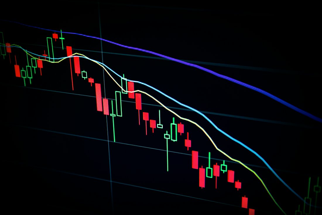
Charts are a language for describing a market, not a way of reading its future. The distinction is the difference between a useful tool and a comforting one.
What a chart genuinely shows
- Where the price has been.
- How large the moves have been — volatility, measured.
- How much of the market moved on a small volume, or a lot on very little. That is a real observation about behaviour.
What it cannot show
A pattern has no memory. A shape that looked predictive before is descriptive afterwards, and the people who point at the past case are describing a chart, not forecasting anything. Confidence on a video is not evidence.
Why it fails more often than it works
- Everyone sees the same chart. When many people act on one, the edge disappears — and your exit is someone else's reason to stay.
- It cannot price news. Regulation, a hack, a large holder moving funds: none of these are on a chart until they are on it.
- Timeframes are chosen after the fact. The same market looks calm on a weekly and catastrophic on an hourly.
Where it is genuinely useful
As a description of your own exposure. Knowing that a given asset has historically moved by a certain amount in a day is a real input to sizing a position — and it is the only use worth relying on.
What to do instead of trading the chart
Set the size from your finances. Pick a cycle that fits. Write down the plan and follow it — this is the whole of it. The averaging approach is a way of removing the temptation to trade the chart, which is its main virtue.